Liquid Bubble are proud to specialise in the creation of high quality flyers and posters. From helping you to promote a specific product or service to getting your message across to a wider audience, the team here at Liquid Bubble create professional looking flyers and posters that match your specific needs.
However, not everyone enlists the help of an expert when it comes to designing for print – especially when it comes to flyers. We’ve put together 10 of the most common (and embarrassing) mistakes people make when it comes to flyer design.
It’s important that the images you use are of high quality. A picture is worth a thousand words – grab their attention for the right reasons.

You don’t have to fill in every space on the flyer. Too many words, too many pictures, too many design elements – it’s not needed! You don’t want your audience to get confused about the message you’re sending – focus on what you’re promoting.

Your flyer needs to be simple and easy to read. This means making sure that the writing isn’t too small, that the font isn’t hard to read and that it’s not in a light or distracting colour.
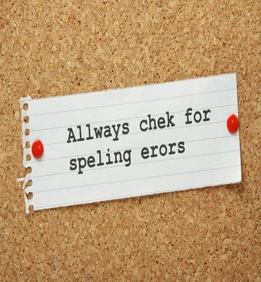
Spelling mistakes on a professional flyer look extremely unprofessional. You need to check, check, check and then check again. In fact, you should get someone else to proofread it for you too.
There are certain things that need to be on your flyer. The name of your company, the details of the product/service you’re promoting, how they can get in touch with you etc., etc.

You don’t need to include every single piece of information. A flyer should only include the important stuff. Keep it brief – give them a taster rather than the whole menu.

The headline is your opportunity to grab your reader’s attention straight away. It needs to be short, snappy and straight to the point! You want them to continue reading!
Simple colours that are easy to read are definitely best. Colours that are too harsh or bright will distract people from your message.

You want people to get in touch with you regarding whatever it is that you’re selling/promoting right? Of course you do! Make sure you include contact information.
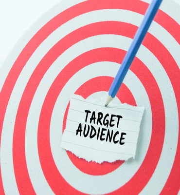
Who is your flyer aimed at? By having a target audience in mind, you’ll be able to focus your design on the correct demographic.
To learn more about our print and design service, please don’t hesitate to contact us. You can give us a call on 0208 900 1191 and a member of our team will be more than happy to help.