When it comes to promoting your business, the finer details can often be the ‘make it or break it’ of any branding project.
Stationery, once considered the letter heads and logo designs of a brand, are now amongst the ever-evolving world of today’s design styles. Envelopes, writing paper, complementary CV detailing and of course, the business card are all key elements of any brand’s print campaign.
Not only can you express your creativity in the artwork, design for print also allows you to experiment with colour, type, detail, inks and paper stocks in order to result in something truly unique.
So, whatever your industry – if you’re looking for a little station ‘spiration – here’s a quick round-up of some of our favourite collections. Enjoy!
Personal Identity, Daniel Renda
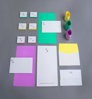
It’s simple, it’s colourful, and it’s definitely effective – so, what’s not to like? We absolutely love the minimalist 3-shade palette that dominates this stationery collection, and complements both logo and style throughout.
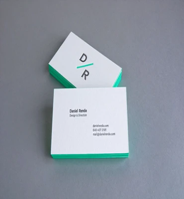
Renda’s delicate yet statement-making letterpress print on Crane’s Lettra fluorescent white is a dreamy combination, and one that’s completely unique. Fun, fresh and eye-catching – it’s a stationery styling that would complement many industry creatives!
AM, Lorenza Venturi
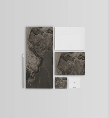
Created as a personal project aiming to develop a visual identity for a fictional landscape architecture company, this collection really draws upon minimalist and textural qualities, promoting a clean yet effective aesthetic.

The image displayed is a satellite image of a geologically active area, determining a clear texture through its simple shape and modest colour palette. A really beautiful and striking stationery collection.
Personal Branding, Anthony Wyborny
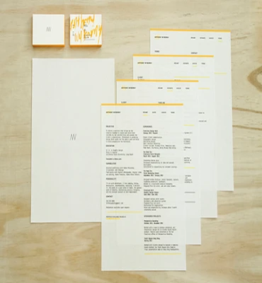
Created for Wyborny’s own personal branding for freelance work, this stationery collection is simple yet effective in both aesthetics and detailing. The simple palettes complement the minimalist type perfectly, creating a striking yet luxurious final product.

The mix between digital and drawn elements really rounds up the collection as a whole, and the statement splash of yellow adds an innovative and daring approach to an otherwise minimalist style. Amazing!
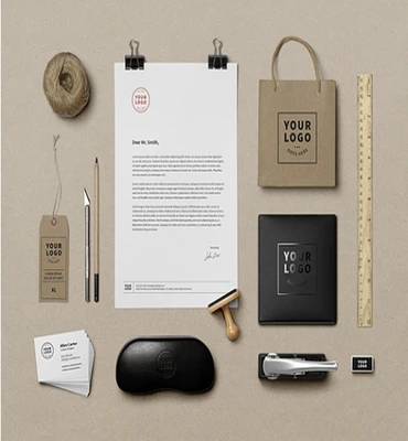
Personal Identity, Ben Johnston
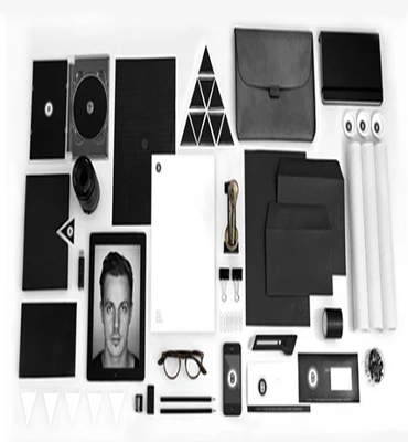
Nothing says professionalism like a monochrome palette, and when a monochrome palette is done well – it’s clean, eye-catching and unbeatable in terms of design and complementary themes. Johnston’s creation of self-branding and packaging elements was crafted as a personal project, and he has literally covered every stationery and branding technique possible.
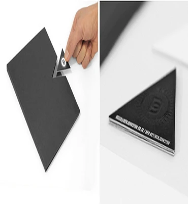
From branded iPad cases to CD cases and custom-cut casing with pull-out business card detailing, this monochromatic collection is perfect!
Here at Liquid Bubble, we’re passionate about design, and when it comes to graphic and web design in London – we’ve got you and your brand covered! Our innovative and professional team are happy to answer any questions you may have, so for more information – please do not hesitate to contact us on 0208 900 1191 today!